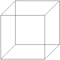
Figure 1 - Box
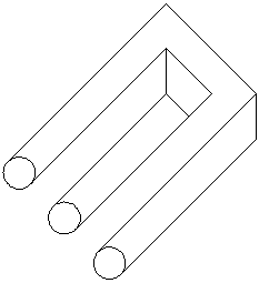
Figure 2 - Two-Pronged
Trident This insistence to view objects as
three-dimensional objects can lead to interesting problems. For
example, Figure 2 is upsetting to look at,
since it appears to be a 3-D object, but the object seems to
change its properties depending on how it is viewed. Covering the
left side makes it appear as an object with two prongs. However,
covering the right side makes it appear as an object with
three prongs, not two. When the entire object is viewed at
once, the object seems to switch between having two and three
prongs. This impossibility confuses the mind.
In other words, the figure uses pictorial rules to create the illusion of three dimensions, but then breaks some of these rules to make the object impossible to construct. Which rules are followed and which are broken determines the strength of impossible figures. A figure which doesn't follow any of the pictorial rules will look planar, and thus no object will be generated in the viewer's mind. Conversely, a figure which follows all of the pictorial rules will be easily represented in three dimensions in the viewer's mind. The interrelationships between the two opposite guidelines provides the illusion of an impossible picture.
M. C.
Escher provides the most popular examples of impossible
figures in his drawings and woodcuts. Some of his most famous are
Belvedere and Waterfall. 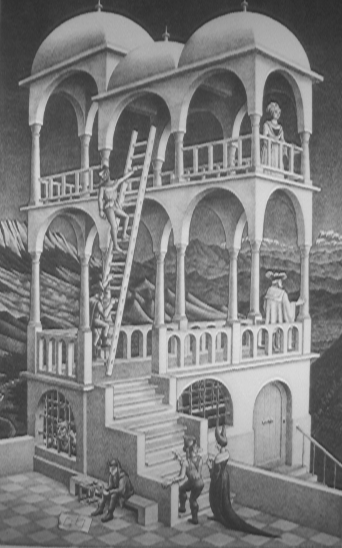
Belvedere In Belvedere, for example, many
impossible features are found. The central building has columns
which start in the front and end in the back, the upper floor is
rotated 90 degrees from the lower floor, and a ladder climbs from
the inside of the building to the outside, yet remains climbable.
A boy sitting outside the building is playing with a curious toy
which looks like a cube, but upon further inspection is twisted
in an impossible way.
In order to understand impossible figures, we must first understand two- dimensional representations of regular three-dimensional objects. A simple line drawing, such as the box in Figure 1, can be interpreted as either a collection of lines connected together forming a shape or combination of shapes, or as a two-dimensional representation of a three-dimensional object. The cues that determine which of these interpretations is made are well-known. However, it is not known how many of these cues or in what combinations they must be found before a drawing will be interpreted as having depth.
Pictures are by their very nature two-dimensional. However, they often represent three-dimensional objects. A variety of cues are used to form a three- dimensional representation of the figure of interest. These include interposition, height-in-the-field, linear perspective, texture gradient, size, shading, and atmospheric perspective. Combinations of these cues create illusions of depth in a picture. Misapplication and/or perversion of these cues can create impossible figures which appear to have depth, yet aren't physically possible.
Interposition, or occlusion, is the overlap of the image of one object over the image of another. When this happens, we judge the image which is obscured to be behind the other image, and thus farther away. This is one of the primary cues used in distance perception. A picture which does not follow the laws of interposition does not appear to be correct. (Biederman, 1987)
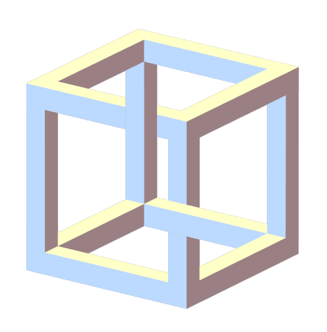
Interposition is used in many impossible figures to suggest that one part of an object is in front of another. For example, in the impossible cube held by Belvedere, some of the bars seem to cross in front of others. Spatially this is impossible, but we interpret it as happening anyway. In the building which Belvedere is sitting in front of, pillar A obscures the bottom of pillar B, but pillar B obscures the top part of pillar A. Thus it appears as if pillar A is in front of pillar B at the bottom, but behind it at the top. This contributes to the illusion of the building being twisted.
The vertical position of an object in the image, or height-in-field, is another cue which we use to determine depth. Objects placed higher in a picture appear to be farther away. Our normal visual field extends from the ground just ahead of us to the sky above and ahead of us. The horizon is about midway in the field, and objects move towards the bottom of the field as they become closer. Thus far-away objects are higher in our visual field than closer objects. We extend this to pictures, and thus get the height-in-field effect.
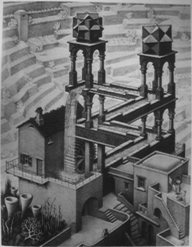
Waterfall M. C. Escher uses this cue in Waterfall, a picture of a building constructed
with a flowing stream which flows downhill from the bottom of a
waterfall around a path until it arrives at the top of the
waterfall, where it falls to the bottom, restarting the cycle.
The path the water takes seems to recede into the distance rather
than go up to the top of the waterfall because subtle cues are
used to enhance the height-in-field effect. This allows the water
to always flow downhill, yet end up higher than it started. The
cues which are used to enhance this effect include linear
perspective, size cues, and texture gradient.
A very important cue, especially for line figures, is related to the Gestalt law of Prägnanz, in which objects are grouped to achieve simplicity of form. Figure 1 uses this idea to create the illusion of depth. The figure is interpreted as a box since that is a much simpler object than any planar object or combination of objects which can be formed from the figure. No other cue is present in this figure, and yet the representation of a three-dimensional figure is quite compelling.
Figure 1 is picture is ambiguous due to the lack of depth cues other than the law of Prägnanz. Two different orientations of the box can be seen by modifying the mind's three-dimensional representation. In the most easily seen orientation, we are looking into the side of the box. In the other, we are looking down at the top of the box. If another cue, such as interposition, texture gradient, size, or shading were used, then this ambiguity would be resolved.
The law of Prägnanz and interposition are the only two cues used in the Two- Pronged Trident of Figure 2. Furthermore, interposition is limited to the top right part of the figure. However, that is enough to make the entire figure appear three-dimensional. This illusion can be heightened by adding other cues, such as texture gradient and shading, but stands on its own without them. These two cues are both necessary for the illusion. Without the law of Prägnanz the figure would appear two dimensional, and without interposition it would be impossible to draw at all.
Another common feature in our environment is linear perspective. The common example for this is parallel train tracks which appear to meet in the distance. A drawing which shows lines meeting at the horizon will appear to have depth due to this effect. The previous example used linear perspective to enforce the idea that the water was flowing into the distance, rather than up.
Size is a very important cue for distance perception. The relative sizes of two objects determines which we view as being closer. Also, the familiar size of an object influences the distance at which it appears to be placed. For example, a picture of an elephant and a mouse of the same size would appear as if the elephant was much farther away than the mouse.
As mentioned above, Escher used this cue in Waterfall. The illusion of the stream moving into the distance is reinforced by it's decreasing width and the decreasing size of the brickwork enclosing it. The geometric figure directly above the waterfall is also smaller than an identical one partway along the stream's path. This further enhances the effect.
Texture gradient refers to the texture of surfaces becoming coarser close to the observer, and finer farther away. Pictures can exploit this to give the illusion of depth. The idea of texture gradients is a comparatively recent idea in perceptual psychology, but has been emphasized heavily by several researchers, most notably Gibson.
This cue is also used in Waterfall. The texture of the brickwork enclosing the stream gets finer as the stream moves toward the top of the waterfall, heightening the effect.
Shading in a picture can also give the illusion of depth. It gives information about parts of an object which project or are inset, and gives the impression of solidity. Dark regions are interpreted as being farther away from a light source than light regions. Since lighting is assumed to be from above and behind the observer in almost all cases, darker regions seem to be farther away. The amount of contrast determines the magnitude of depth seen in the picture. (Berbaum, Tharp, and Mroczek, 1983)
Shading is used in Belvedere, along with interposition, in the creation of the inside-out building. The pillars are light when they are supposed to be on the outside of the building, and dark when they are inside. Shading can also be used to heighten the effect of the illusion of Figure 2. If the parts that show the three-dimensional nature of the object are shaded, the effect is increased dramatically.
The last cue we use to give information about distance is atmospheric perspective. This is the effect of hazy figures seeming farther away. This is another effect of our lifetime of experience, where faraway mountains are indistinct (or in Claremont, where the next building is hazy.) This cue can't be used in line drawings, but more detailed pictures and paintings often use this effect.
In the outside, three-dimensional world, many other sources of depth information are available. Most of these are not applicable to static pictures, however, including vergence eye movements, accommodation, motion parallax, the kinetic depth effect, and binocular disparity. It is interesting, however, that the lack of these cues does not preclude the interpretation of a picture as representing three dimensions. This points out the idea that an impossible figure may be made using different combinations of cues, and that no specific cue is necessary. For example, shading is used in many of M. C. Escher's works, but simple line drawings, which have no shading cues can still depict impossible figures. The law of Prägnanz can make a simple line drawing appear to have depth, but it is often difficult to apply it to more complicated drawings.
Several different types of approaches have been used to try to explain distance and depth perception. Normally they are tested by seeing how they work in everyday situations, for correct perceptions. By examining them with respect to impossible figures, additional insight on these theories can be gained, along with a better understanding of impossible figures.
Empiricism is a philosophical approach which asserts that "all information is derived from sensory perceptions and experiences" (Matlin, pg. 200). Distance perception, then, is a learned skill, not an innate one. Empiricists emphasize that any two-dimensional representation of a three-dimensional object is ambiguous, since many different 3-D objects can be depicted in two dimensions in the same way. For example, a ball and a cone viewed from one end look the same in two dimensions. Despite this ambiguity, we do not have many problems with viewing pictures. In fact, we almost always interpret the picture correctly.
This problem was tackled back in 1709 by George Berkeley in "An Essay Towards a New Theory of Vision." He proposed the idea that distance perception is learned by associating various distance cues with kinesthetic information about distance. "Kinesthetic information is nonvisual information that includes all the muscular information we receive as we interact with objects" (Matlin, p. 200). Thus in interpreting a two-dimensional figure, we use distance cues which have been derived from actual experience with three-dimensional objects.
The constructivist approach is derived from the empiricist tradition. It stresses the internal constructive process which an observer uses to transform incoming stimuli into a perception. Constructivist theory emphasizes the ambiguity of sensory data and the task which must be solved in order to create a correct perception. This theory explains well how we solve visual puzzles which are foreign to our experience. For example, take the case of learning how to tie a knot in a piece of rope from a book. The task definitely requires concentration and a mental process. With respect to impossible figures, the constructivist approach is quite valid. From personal experience I can attest that the mind is working on these problems quite actively, judging from the confusion which results from looking at them.
James J. Gibson put forth a theory diametrically opposed to the empiricist and constructivist approaches. He believes that the visual information we receive is rich and completely describes the real world and does not need to be supplemented with nonvisual information. He argues that most of the cues mentioned above are not relevant in real life. He proposes an alternate explanation called "ground theory," in which distance perception depends on the surfaces in the environment. His theories stress texture gradients and motion perspective.
Texture gradient is used in some of Escher's impossible figures. However, many impossible figures have no texture information, such as the Two-Pronged Trident. There is also no motion perspective information available in a static picture. Since it is obvious that these figures appear to have depth, some other cues must be responsible. Thus Gibson's approach doesn't completely explain perception, since it can't account for the response of an observer to impossible figures.
Ramachadran (1986) suggested that these theories are not mutually exclusive, and that our visual system probably uses components of all of them. This seems to me to be a valid point, and it meshes well with the idea that a combination of cues can be used to create impossible figures.
The Gestalt approach to psychology reveals some interesting insights about impossible figures and why they are so captivating. This theory emphasizes that we perceive objects as wholes rather than as parts. Our perceptual system organizes everything we see into groups through specific laws. Gestalt psychologists put forth three concepts important to the perception of figures: grouping laws, the "goodness" of figures, and figure-ground relationships.
The five grouping laws describe why pieces are put together into an object rather than remaining separate. The first is the law of nearness (or proximity). Objects near each other tend to be seen as a unit. The law of similarity states that objects similar to each other tend to be grouped as a unit. The law of good continuation states that objects arranged in either a straight line or a smooth curve tend to be seen as a unit. The law of closure states that when a figure has a gap, we tend to see it as a closed, complete figure. The law of common fate states that when objects move in the same direction, we tend to see them as a unit.
The two laws which have the most bearing on impossible figures are the law of good continuation and the law of closure. Belvedere's amazing box wouldn't be very amazing if we saw the sides as being cut into pieces. Then the object would be perfectly reasonable. Due to the appeal of the simpler explanation of closed, continuous sides, we see them as uncut and thus impossible. The mind still doesn't like the figure, even after recognizing that the object could be possible if the sides are cut appropriately.
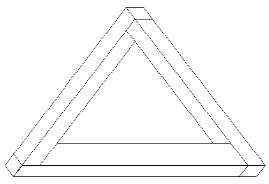
R. L. Gregory discusses a similar case with the Penrose impossible triangle in his essay, "The Confounded Eye." The Penrose impossible triangle is a physical object which appears to be impossible. The impossibility arises from the assumption that the triangle lies in a plane. In fact, one side projects out at an angle from the other two. If the object is viewed from the correct angle, the images of the sides overlap in such a way that it appears to be a closed, planar triangle, although twisted in a way which is impossible. Even after viewing how the illusion is made, however, the viewer still sees the original figure as planar and thus impossible. Gregory concludes that "the perceptual hypothesis- generator does not have elaborate check procedures; so we are stuck with this paradox" (Gregory, pg. 88).
An extension of the Gestalt laws of continuity and closure is the law of Prägnanz. It states that "of several geometrically possible organizations the one will actually occur which possesses the best, simplest, and most stable shape" (Koffka, 1935, p. 138). This general principle goes a long way towards explaining why impossible figures are so compelling.
Recall how it is easier to see Figure 1 as a box than as a collection of irregular planar figures. The law of Prägnanz explains this by asserting that a box is a simpler figure than a bunch of irregular figures, even though it is a three-dimensional object. Similarly, the two-pronged trident of Figure 2 is viewed as three-dimensional since it is simpler that way than as a collection of lines. That the object is impossible doesn't seem to impair its simplicity.
If only half of the trident is viewed at one time, the ambiguity disappears, and the figure is possible. Then it can be easily seen that the three-dimensional object is simpler than the two-dimensional figure. Thus it appears that the simplicity of the object is determined before its physical realizability. This is also the conclusion which Gregory reached when considering the Penrose impossible triangle.
We have seen that some common depth cues can make two-dimensional figures seem to represent three-dimensional objects. In some cases, the object which is represented has no physical realization. These "impossible figures" use depth cues to seem three-dimensional, yet misuse them in such a way as to render the object physically impossible. This happens despite the mind's realization that the figure is impossible. The illusion often persists even when the mind knows the explanation.
Several classes of theories have been advanced to explain depth and distance perception. Two ways to validate these theories exist: against real-life, valid perception, and against illusions and impossible figures. The former method is preferred by most researchers, but the latter should not be neglected. Gestalt principles seem to explain impossible figures better than any other theory, but it appears that all the theories have valid contributions to psychology.